We have rarely had the pleasure of working with a client team that are so in tune and aligned with one another. The TES team hardly even discussed things and we presented our concept designs. They just appeared to instinctively ‘know’ and agreed with one another – which indicates that have a solid understanding of who they are as a company and the nature of their customer base. It’s very rare to see such clarity and synchronicity of thought within a business team and it was a pleasure to witness. As a result, we didn’t need to do much additional discovery work for this rebranding for Trans European Stone.
Trans European Stone are the sole UK importers for a certain stone and quarry in Europe. They specifically wished to retain the colour to their previous logo but otherwise wanted to modernise and update their look, whilst ‘being mindful that the building trade is rather traditional by nature’.
At S2 we pride ourselves that we produce work that is fitting for our clients and the arenas in which they operate. Even though this was not our usual full rebranding exercise we still undertook some upfront market research with our client’s customer base and investigated the core values of their brand to properly inform our design process. As is often the case this process threw up some interesting insights that our clients were not fully aware of and provided some food for thought as we framed the requirements of the brief together.
S2 then presented lots of initial design concepts, exploring various visual approaches and messages. This is when the cohesion and clarity within the TES team really shone out. We narrowed down and refined the initial concepts very swiftly, and then in further consultation honed the final concept into the finished logo. We are all confident that the end result is a good brand progression for them that will be embraced within their market sector, repositioning them as needed.
As usual, S2 have been mindful of the need for a social media-friendly ‘mark’ and the fact that the full company name was ‘a bit of a mouthful’ – with some negative connotations for some clients associated to the European aspect of their full name. Additionally, as they are often referred to as TES within the trade, it was obvious the new design should embrace the use of initials going forward.
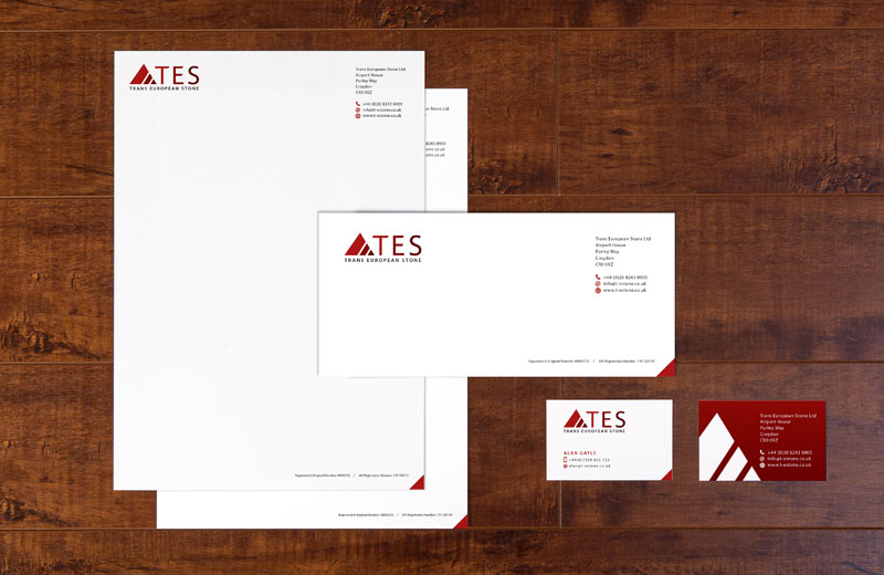
The final logo is simply a stylised, visual representation of what they do – carving blocks of stone from the mountainsides, refining the block sizes needed with textures and finishes as required, and delivering the blocks to their customers building sites.
The three tones of red are used to further reflect that process of refinement as is reflected in the colouring of the TES initials, which also helps to create differentiation and separation of the letter too. The typeface used for the initials has been altered slightly to give a bespoke letterform and also reflects the angles of the ‘mountain’ graphic.

 © S2 design & advertising Ltd
 © S2 design & advertising Ltd