TechFarm
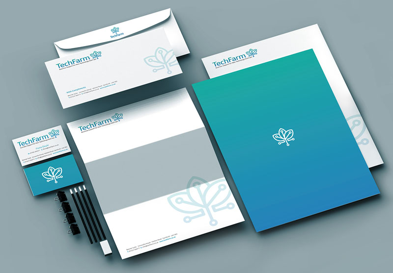
Here is a logo mark created for TechFarm, a growth hub for new tech initiatives that also helped their client start-ups to find specialist manufacturing partners in the far east.
The logo mark was created to convey an idea of growing from a small seed – with a sense of duplication.
The colour choices had to work for both the western market and the eastern markets.
In western cultures, blue and green are both widely used colours in the technology world as they convey a sense of serenity, stability and trustworthiness. The particular tones used also had a sense of freshness and therefore worked for a firm dealing with new innovations. In the eastern culture, green has much the same meaning as it does in the west with associations of ‘sprouting’ and new beginnings but blue is also associated with spring with the added notion of ‘advancement’.
The typeface was purposefully ‘soft’ with no hard corners – partly because many technology companies often adopt too masculine a persona with a high-tech, hard-edged look to their logo’s – and partly because we wished to convey a friendly and approachable look to attract small technology-based start-up’s in the first place.


 © S2 design & advertising Ltd
 © S2 design & advertising Ltd