Sojourners
The idea behind Sojourners is essentially an upmarket (business class) international Airbnb.
All accommodation was 4-star or above (based on UK standards) but unlike Airbnb, Sojourners expected to always be full properties – not just a room in someone’s house. The service was aimed at travellers who are staying for extended periods and want an apartment or house which they can really call home and truly relax in – with all the home comforts to hand. This led us to the strapline ‘Travel abroad. Feel at home’.
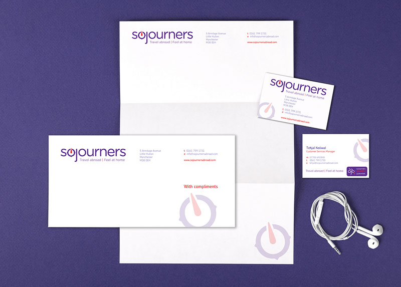
The mark itself is based around the idea of a simplified navigational compass – combined with an open, round-cornered typeface which conveys a sense of openness and friendly approachability.
We decided to play with the brand mark a bit in the design of the quality guarantee mark to give it a real sense of uniqueness and character – using elements of the core brand to suggest a monocle-wearing inspector’s face.
The quality guarantee mark is for those hosts who wish to undergo a specific inspection and therefore receive a preferential and more detailed information listing. Giving this quality assurance mark a personality and uniquely ‘sojourners feel’ was important.
As usual we have considered how the brand would simplify for social media usage too where just the compass could be used. In colour psychology purple is a associated with luxury and sophistication.
We created this brand id for a funding pitch – we hope the team behind this are able to raise the capital needed to take this live.


 © S2 design & advertising Ltd
 © S2 design & advertising Ltd