David Foxx & Associates
Chartered accountants – they are everywhere, right?
If you are in business you probably know several you could name instantly.
In such a competitive market standing out is important. But standing out does not necessarily mean being brash, loud and overtly ‘in your face’.
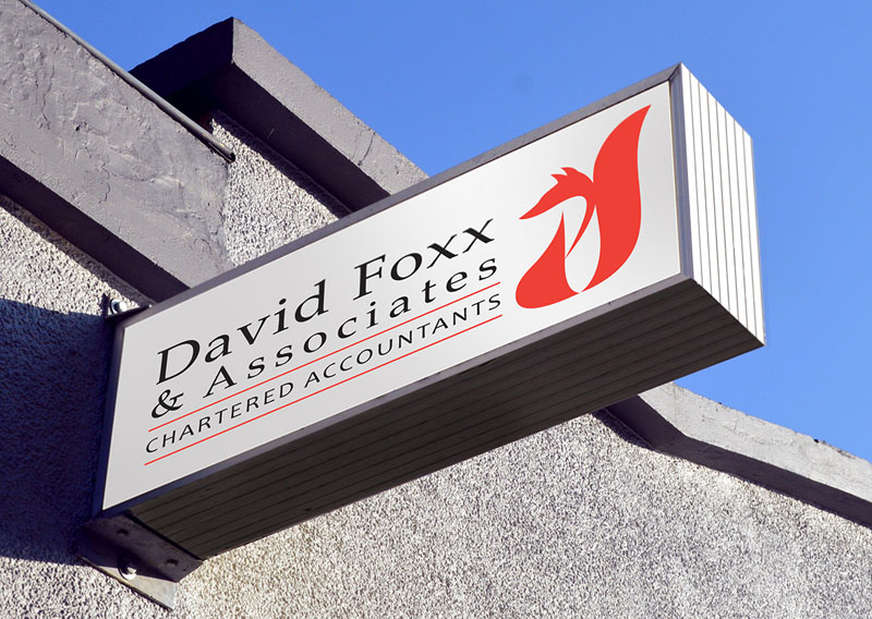
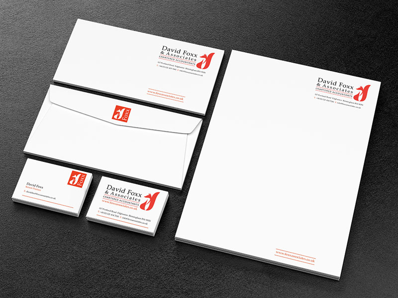
Our design for David Foxx & Associates is all about subtlety and understatement.
If you look closely you can see the shapes of a lowercase d and f in the shape of the fox icon.
The brand mark exudes confidence, refinement and stability through its very understatedness. The icon combined with the choice of, and design of, the serif typeface projects a company that doesn’t need to try too hard.
We had to use red – given the name, but the bright, slightly orange tone is uncommon in the ‘play it safe’ world of accountancy, as red is commonly understood as an assertive or even an aggressive colour. Used here as combined with the restraint of the rest of the design it creates just the right balance of attention-grabbing and assuredness.
As usual, we developed different formats of the logo for use on social media and small usage.
You don’t need to shout too loud, if your target client audience are more established companies who understand the importance of professionalism and quality, then those are the very things your brand needs to exude.


 © S2 design & advertising Ltd
 © S2 design & advertising Ltd