

Prime London
Prime London is a high-end estate and letting agents that serve Central London, with offices in Belgravia, and at Lambeth Bridge.
They handle some of the finest properties in the world, whether representing Royalty, A-Listers or Business Leaders, their clients need to be able to trust that they receive the service they need – always delivered with the utmost discretion.
Their properties exude quality and prestige and it was clear that their brand needed to reflect those same values. But we never presume anything, and so we began with our usual investigation process. We conducted research and analysis to gain a clear picture of the competitive landscape, a true understanding of the factors their customers placed the most value on, and took time to understand their customers’ journey. We investigated what made them different. We interviewed both customers and staff members to get true-life insights into both the successes stories and the frustrations, presenting our conclusions in a report which included our recommendations.
We can’t share that strategy as that would mean giving away some of Prime’s intellectual property and its competitive advantage. However, the design of their brand identity, their positioning and their regular communication items, were all informed and crafted in the light of that strategy.
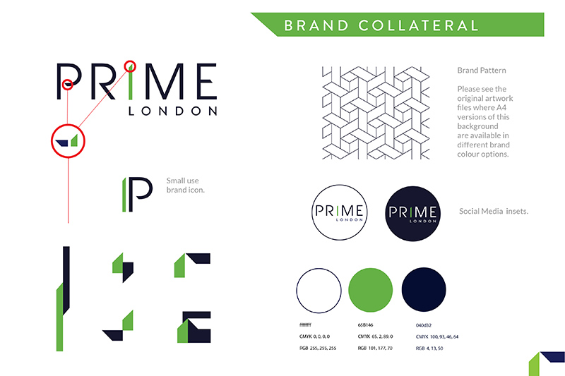
The new logo is sleek and elegant. It is understated yet houses some unique elements that are used as the foundational building blocks of the wider brand collateral. The design is purposefully modern, leaning into key aspects of their working practices that customers cited as important factors for them.
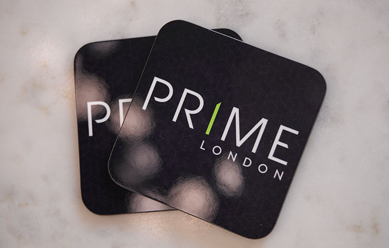
A spot UV varnish was added to the soft-touch business cards to add an element of prestige and a brand pattern was devised, along with other elements of brand collateral, that emulate the common language used in the luxury brand market.


 © s2 design & Advertising Ltd
 © S2 design & advertising Ltd