Arthritis Action
Arthritis Action (AA) was the new name decided upon when we were charged with rebranding the organisation formerly known as The Arthritis Association.
The background research conducted for this project was very extensive and included present members, past members, potential members, doctors (and other relevant medical professionals), as well as carers of people living with arthritis. This research focused our attention on what the members valued most – and also drew our attention to some aspects that were ‘problematic’ within the present offering and customer journey.
As a result, we proposed a strategic shift that meant an entirely different ‘route to market’. Historically the charity had sought to communicate with its target audience directly.
Research identified four distinct problems in the established approach:
- People wanted to know that their doctor supported the initiatives and advice offered. Their own GP, not a random doctor’s (or paid ‘white coat’) validation.
- Identifying and reaching people with arthritis directly was fraught with problems and results were poor.
- Some of the activities and assertions promoted were now disputed by some medical professionals.
- The name Arthritis Association was seen as rather ‘dry’ and old-fashioned – and proved to ‘put some people off ‘.
Our strategic solution refocused the primary communication channels to address GP surgeries directly, providing literature for them to hand to patients during their patient consultations.
We proposed, and AA agreed, to drop those elements from its offering that some doctors felt they could not support. With this new approach agreed upon, identifying potential members and doctor validation now happened in surgery consultations were the GP handed our freshly designed introductory leaflet to the patient. Getting a contact list for GP surgeries is much easier than identifying potential members individually especially given changes in GDPR legislation.
The name change to Arthritis Action helped breathe new life and dynamism into the brand whilst retaining the historic double-A of the historic name.
Initially working with the CEO and selected members of the board, we tested a number of designs and found that one particular brand design and messaging approach performed over 40% higher than others when tested with their target audience. This was not the board’s favoured design prior to testing– but it proved the most effective and therefore the right brand and messaging strategy to deliver the results they needed.
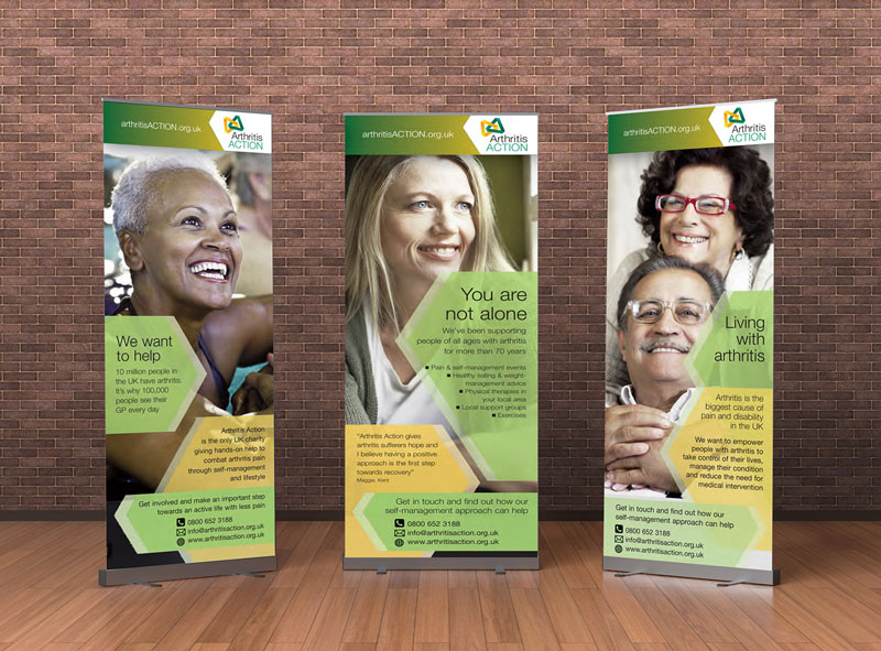
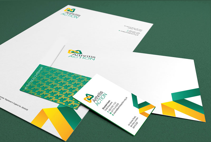
Shown here are the final logo, stationery, promotional materials, brand guidelines, banner stands and designs for advertising and the website.
Once the brand redesign had been completed the new brand direction was launched at a special event in London. We continued to work in tandem with the communications team, monitoring the effectiveness of the revised communications strategy to ensure everything continued to deliver as expected.
We were last supplied figures for the impact of the new brand positioning three years after our rebrand and repositioning exercise had concluded. At that time, the data showed that membership had increased fourfold, and the value per member to AA had increased threefold.
If you’d like further details of the project, Arthritis Action is one of the clients featured in our case studies section.


 © S2 Design & Advertising Ltd
 © S2 design & advertising Ltd