

Ingress
Ingress work in the adult education arena , specifically working with individuals to retrain and reskill so they can pursue new career options.
The S2 team helped develop the ingress trading name as well as their visual identity. Ingress is ‘the action or fact of ‘going in’ or ‘entering’, which works well for training to access a new career path. The look and feel of the brand needed to be ‘lively, friendly and approachable’.
The logo itself is a bespoke typography design. S2 also developed the ‘target’ devise, to work both within the logo but also as a separate entity – forming part of the brand collateral for use as a social media mark through to bullet points within the literature.
The colours used are fresh and bright giving the whole design approach more personality and vibrancy than most of their competition.


 © S2 design & advertising Ltd
 © S2 design & advertising Ltd
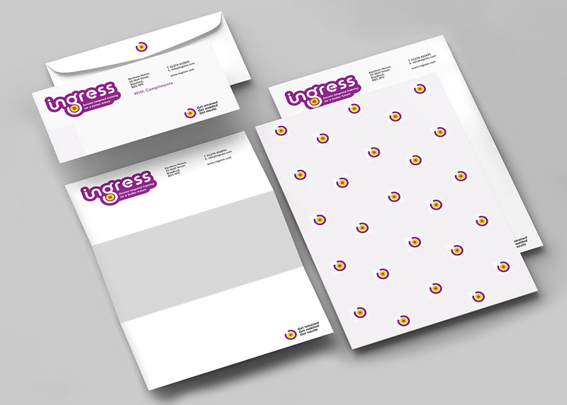