Lemon Hive
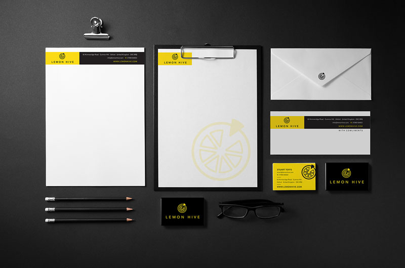
The Lemon Hive brand design is crisp, fresh and clean. A values-driven digital marketing firm, the logo mark is obviously based on the segments of a cut lemon – that also carries the idea of different elements coming together to form a whole –which represents how Lemon Hive approach marketing their clients.
Given the name, our colour choice was pretty much a foregone conclusion. Black and yellow form a really strong colour combination that is highly impactive and commands attention. After all, in nature it’s the combination that denotes that something is either dangerous or venomous.
To create variety and adaptability we created two versions of the logo mark. One, incorporating the sliced lemon graphic into the lettering and one with the elements separated. Thus allowing for usage flexibility and for the graphic to be used as a stand-alone element when appropriate.


 © S2 design & advertising Ltd