

Colorbox
Colorbox are an American firm – which explains the spelling. Although known in the US for supplying large 3D exhibition design and construction, creating the type of exhibit stands that grace large events like the Ideal Home Exhibition or the British Motor Show. But they had no history in the UK and European markets and needed to build brand awareness and reputation. This was our challenge.
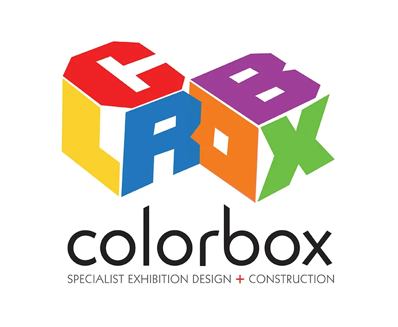
Our logo mark design obviously forms 2 boxes – but it completely misspells the name, removing the vowels from color. The logo was designed to be used with or without the full name underneath it. This approach is common – think about Apple, Nike or even innocent drinks who rarely use the full logotype as their logo symbols are identifiable, distinctive and memorable enough to stand alone.
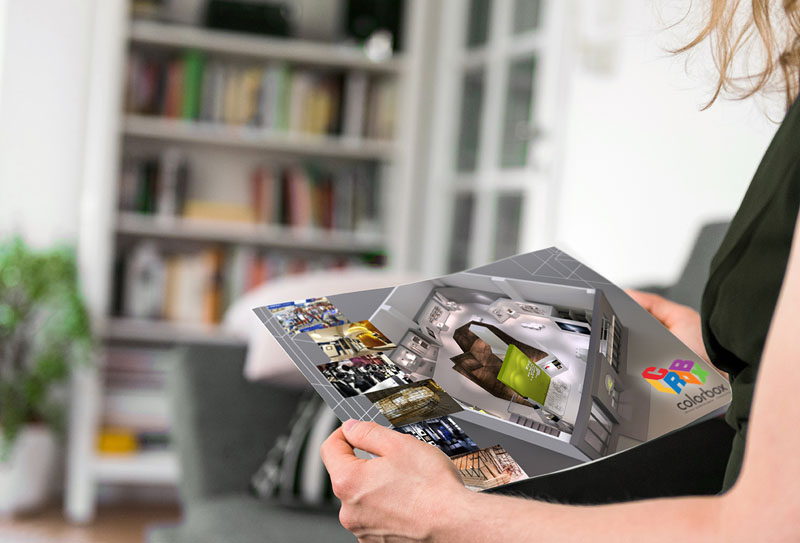
To achieve that ‘stand alone’ recognition your customer base first needs to be very, very familiarized with the brand. So, it’s a long-term strategy and for now, Colorbox will be using the full logo until they have built enough recognition in this new region.
The key strength of this logo design is that it conveys the 3D nature of the work they produce whenever it appears, in whatever format.


 © S2 design & advertising Ltd
 © S2 design & advertising Ltd
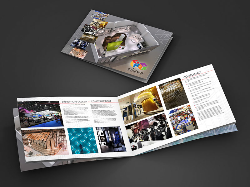