Blar, Blar, Blar
We were approached by a creative copywriting duo as they launched a new start-up, breaking away from the agency they had previously worked for, to create their brand identity.
The duo were quirky, and irreverent – evidently part of their uniqueness, which was reflected in both the way they worked and in the work they produced. Coming from an advertising and journalistic background they had a history of trying to view subjects from different angles to form a unique perspective.
The name Blar, Blar, Blar – a conscious twist on the recognised spelling of Blah – came from our conversations with the founders as we discussed their needs … ‘we need the brand that will attract our natural clients, the usual stuff, those people that resonate with our approach blah blah … and then roll that out to the usual platforms – Facebook, LinkedIn blah, blah’. “You know how it is, people pigeon-hole you and then it’s a battle to change that perception you have to keep reiterating, stating what makes you different – not your usual copywriters … creative concept writers, not merely simply message editors, blah, blah, etc, etc’.
It was a refrain in the conversation, a verbal habit that they had developed over their years of working together – but it stuck with us.
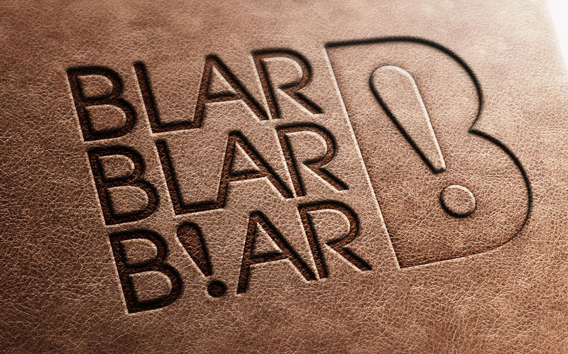
We were thrilled when on presenting our design ideas the duo instantly understood our tongue in cheek jest, grasped the idea of the mis-spelling and responded positively to our idea. Using the exclamation point instead of the final L further emphasized the unusual twist that this writing team bring to their work. That then logically extended to form the counter within of the B icon.
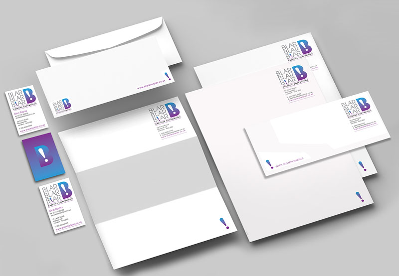
The brand, therefore, has 4 key elements – that can be used together or in isolation when appropriate. The unusual spelling, the capital B icon with the exclamation point inside, the backward slanting exclamation point itself and the colour transition used.
The images show the brand mark applied to stationery and the debossed cover of the duo’s branded notebooks.




 © S2 design & advertising Ltd
 © S2 design & advertising Ltd