Colliers Scaffolding
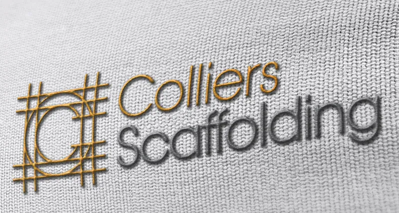
The basic premise of the Colliers Scaffolding identity is pretty simple to grasp … The initial C has ‘scaffolding’ around it. Simple yes – but effective. The logo is instantly recognizable and understood. The typeface used is also scaffold-like in its basic design with simple clean lines, functional and dependable.
Yellow is a bright, positive colour – often used in the heavy machinery side of the construction industry but less so in the realm of the smaller contractor.
So the vibrant yellow adopted for the identity gets Colliers noticed and remembered, projects a warm and positive vibe whilst also aligning the firm with larger players in the general construction world.


 © S2 design & advertising Ltd
 © S2 design & advertising Ltd