

Axon
Unless you happen to be a wholesale kitchen appliances buyer it’s unlikely that you know the name Axon.
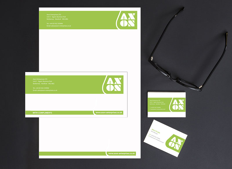
With our logo, stationery and folder designs we wanted to define a confident, solid brand that stood out from the competition and did not overly align with any individual household goods manufacturers visual identity.
The block text used is based on the classic white goods familiar to most product design in the kitchen appliance space. The bright lime-green was purposefully chosen as this was not a section of the colour spectrum used by any of the manufacturers or direct competitors.


 © S2 design & advertising Ltd
 © S2 design & advertising Ltd
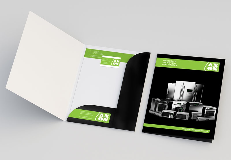