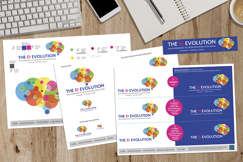
A change of direction and focus for our client meant exploring a new name and identity. A couple of our early concepts were discarded as we found we were unable to gain a full international registration of trademark, with all the legal protections that trademarking affords. We eventually settled on The EI Evolution and developed the logo design and key messaging based around the concepts the human brain and how we process information and both gain and grow emotional intelligence. Shown here are the presentation sheets for the logo and a slide from our concept for their PowerPoint presentation.
The old days of being restricted to three colours in your identity are pretty much gone. The three colour rule was an old ‘branding rule’ that was primarily driven by the large print costs associated with full-colour printing in bygone days. As most communication has moved online, then most brands are created to be digital-first these days. And digital presses have made full-colour print affordable for every size of business – so restrictions in colour are really not that applicable anymore … the decision should really be much more about what is most appropriate for your brand?Just look at Google, ebay, NBC, Mircosoft or the Olympic rings – they all break the three colour rule and it hasn’t really hurt their impact in the marketplace any!


 © S2 design & advertising Ltd
 © S2 design & advertising Ltd