Repaid
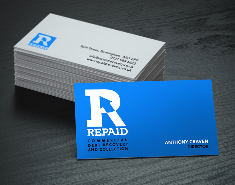
A commercial debt recovery firm, the Repaid logomark is quite self-explanatory. The counter of the R is an arrowhead referencing the flow of funds back to where they belong. The R symbol and Repaid text are set in a bespoke typefont adapted from a standard block serif font, creating a unique logotype. Block serifs denote solidity and dependability, which are also common associations with the colour blue so the overall message is one of strength and of trustworthy security.


 © S2 design & advertising Ltd
 © S2 design & advertising Ltd