

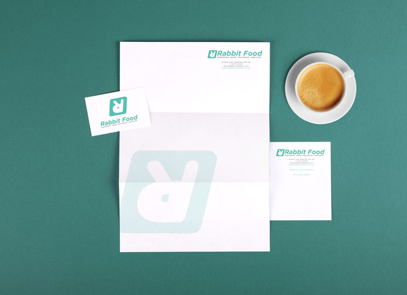
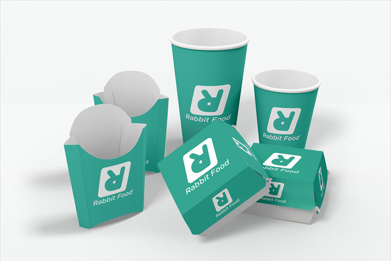
Rabbit Food
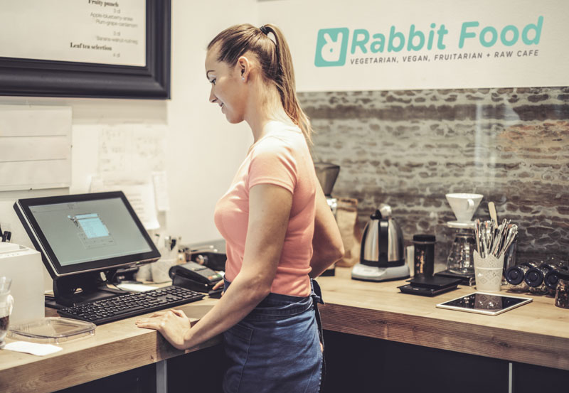
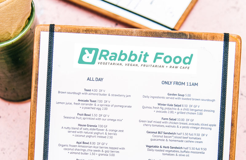
These designs for a new vegan café purposefully turn the common objection about vegan diets on its head. Embracing the term ‘Rabbit Food’ as our idea for the name of their new café was brave of the owner, but the limited research we were able to conduct suggested it was going to work. It also helped to suggest they did not take themselves too seriously, which was another criticism our research found was often levied at vegans and vegetarians.
We wanted to create a friendly, welcoming feel, so we used a rounded typeface devoid of any sharp corners. Inverting and adapting the R to forming the rabbit head logo itself. The green tone was chosen as it related idea of ‘just eating leaves’ but also in colour psychology carries meanings of health and serenity – which resonated well with the general ethos of the café.

 © S2 design & advertising Ltd
 © S2 design & advertising Ltd
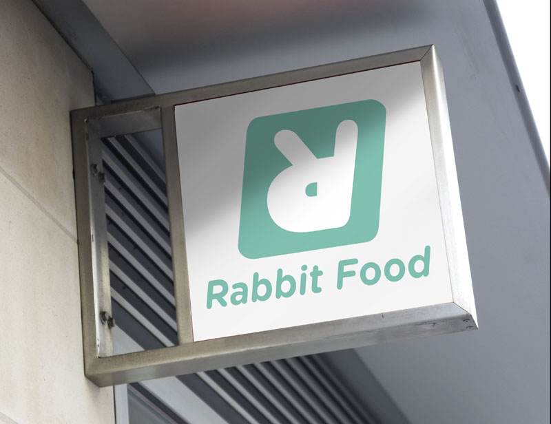