

Kingfisher Building Products Ltd
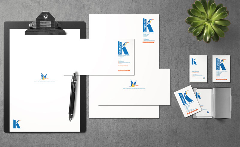
Kingfisher Building Products Ltd is unlikely to be a name you recognise unless you are in the construction business and buy wholesale supplies. We reimagined their branding to make it more appropriate to the modern world. The original logo featured a realistic rendering of a kingfisher on a branch with a golden sun behind and a fat, serif font used for the lettering. The overall impression was of a brand that would feel more at home in the 1970’s than the 2000’s.
Our redesign simplified the image of the kingfisher making it usable at small sizes. The core K icon introduces the bird sitting on a block that is more cognizant with the building trade than the branch of the original logo. We then created the range of secondary bird images to be used across communication materials to breed more dynamism and variety into the brand. We also devised a variant of the logo that is self-contained with the Kingfisher name appearing in the vertical stroke of the K to again allow for variety and different usage contexts.
We used a simple san serif font, with cleaner lines and sharper corners to also reflect the construction trade with a ligature joining the F and I, making a more pleasing typographic solution to the lettering of the name.
The new brand mark builds from the established logo – in form and in colour with the golden sun from the original logo reflected in the colours used within the new rendering, creating a sense of continuity whilst revitalising and updating the brand presentation.


 © S2 design & advertising Ltd
 © S2 design & advertising Ltd