Howden
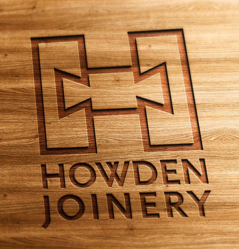
The Howden brand logo and literature communicate skill and craftsmanship. From the simple logo device of using dovetail joints within the capital H to the choice of elegant font, the logo stands as a mark of quality.
The brochure cover purposefully moved away from simply showing images of beautifully crafted furniture to show the skilled workers behind the final product. Reinforcing the narrative of traditional skills and craftsmanship.
Some marketers will tell you that you should only sell the impact of the end product – and they would use a lifestyle shot of a family enjoying their new kitchen possibly. And they would get sales doing so.
But in a market where every other firm is promoting themselves in that way we chose to offer Howden a different approach that would denote them as distinctly different. Emphasising Howdens unique selling points – its bespoke, hand-made approach, attention to detail and highly skilled workforce. The heritage of a firm and the craftsmanship brought to each and every project is a powerful story to put before their potential customers.
The finished product does speak for itself – and featured heavily throughout the literature but it was the narrative and skills behind their bespoke furniture, that our research told us, really drew people to Howden.


 © s2 design & Advertising Ltd
 © s2 design & Advertising Ltd