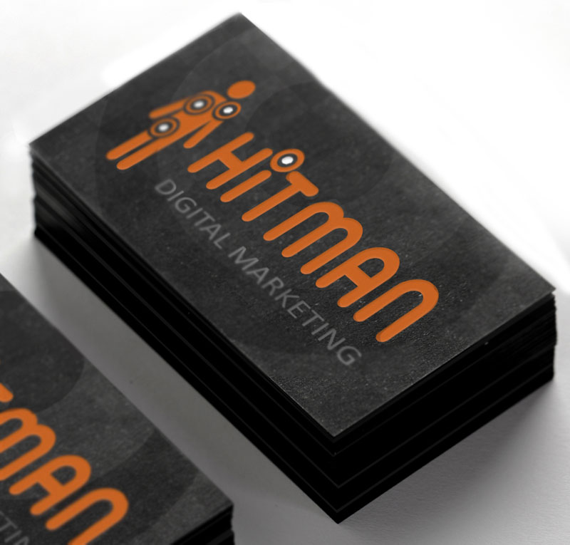
Hitman Digital Marketing
With an established background in the music industry, the Hitman imagery had always been associated with a ‘DJ’ character. But the firm had moved away from their musical roots and now worked across a range of entertainment and B2B businesses too. The DJ character was no longer appropriate.
Our strategy pivoted the Hitman meaning bringing in ideas of the ‘hit’ and of the assassin. Sharp-shooting and being on-target were associations that worked well for digital marketers and could easily be expanded to be used within their wider marketing story when engaging potential new clients.
Two variations were created, one with the figure incorporated into the name, replacing the i, and one with the figure separate. This allowed for greater flexibility and also allowed for the figure to be used independently of the full logotype. Once we had the core concept, creating supporting elements of figures in different scenarios was a fun roll-out idea.
The limited colour palette of orange, black and white defined a bold, strong look that suited the brand well. Orange is also a fun, playful colour that helps dispel any potential discomfort people may feel towards the imagery of an assassin’s hit. Hitman traded for a number of years before being taken over by a larger firm.


 © S2 design & advertising Ltd
 © S2 design & advertising Ltd