
Harley Street Speech Therapy
Simply mentioning Harley Street in London people instantly think of the top private medical practices in the land. Our designs for Harley Street Speech Therapy built on those assumptions and expectations.
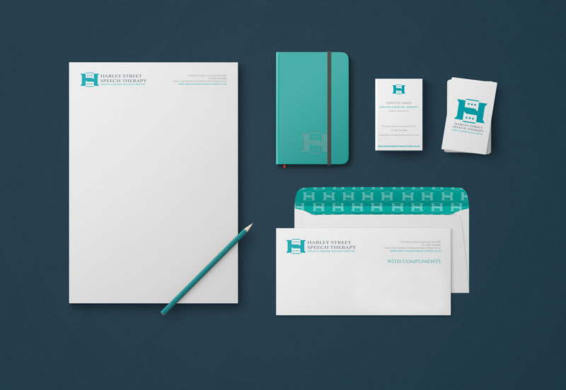
In the graphic device we created for Harley Street Speech Therapy we’ve combined a capital H with the established media icon for speech – a speech bubble containing three dots. We chose an elegant serif font to reinforce the prestige and heritage aspects inherent in how people perceive a Harley Street practice.
Creating a repeated pattern as brand collateral further helps establish the feeling of heritage and value as such patterns are common elements of high-value and heritage brands.
We purposefully moved away from their clinic’s traditional bright purple colour to a more muted green. Green is associated with health, well-being and healing, as well as carrying perceptions of prestige and serenity. Although in some cases we would often advise a client to adopt a colour that is not widely used in their industry in order to create a clear brand differentiation, in this case, the positive associations of green in relation to their offer and customer comprehension far outweigh the question of differentiation.


 © S2 design & advertising Ltd
 © S2 design & Advertising Ltd
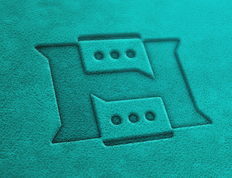