The partners of this new start-up had originally wanted to call themselves True North – which seemed a great name for their specific focus – helping people discover the right job to suit their skill set.
Unfortunately, with some quick research it quickly became apparent that the name was already well used – both within their industry and further afield. To avoid any legal complications or trademark infringements S2 started with a naming exercise.
So why 14° West? It is the difference in angle from magnetic north to true north, and thus gave us a story to tell – and formed a great conversation starter for the partners to use when meeting potential new clients.
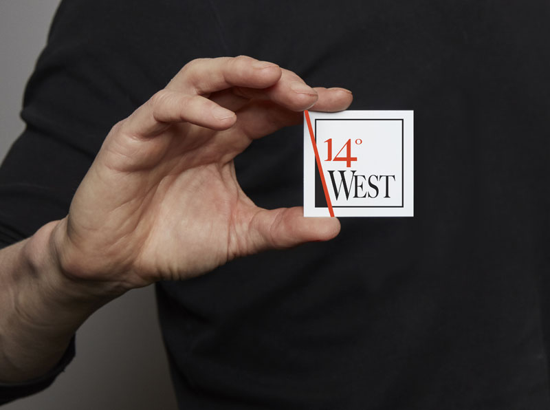
Our final design followed directly from the name. The red bar is set at 14 degrees. The W of West has been adapted so the strokes match the same angle – and therefore the rest of the text follows suit.
The addition of the strapline ‘find your true north’, which subtly runs along the red line element of the design on the back of the business cards, helped cement the concept.
Black, white and red is a strong, no-nonsense colour combination. It’s bold and assertive without being overly oppressive and heavy – at least not in the way we’ve used it here.
The juxtaposition of colours in the square format helps create a sense of transition and change. Reversing the colours on the letterhead simply helped give the letterhead more gravitas whilst introducing a more fluid and adaptable approach to the logo mark.
In our modern world brand marks do need to be adaptable and ‘alive’ – so building such usage adaptability in from the start is important.
The red line also breaks out of the box, visually representing the impact that the firm can have for individual clients – breaking free from the boxes they are in and onto new jobs or careers.
The use of a square card helps define the firm as something a little unusual in their arena too – which was a good fit for the energetic, entrepreneurial directors.
It’s our usual practice to consider the full usability and dynamic range of a brand mark as we develop our designs. Social media marks and small-use icons are now essential. In the case of 14° West we created a variant of the logo mark with reduced elements. We cut back the design element to the square, red line and text 14°W which retains legibility even as small sizes.
This again added more adaptability and fluidity to the overall brand without undermining the key elements or brand impact.


 © S2 design & advertising Ltd
 © S2 design & advertising Ltd