Bokeh Photography
Bokeh are a small independent film and photography outfit based in Birmingham.
Many photographers simply trade under their own names but the team behind this venture were ambitious and entrepreneurial. They wanted to ‘look and feel more established and professional … we want our brand to deliver a real sense of quality and give the confidence for us to approach and play with the big-boys’.
Bokeh is a Japanese word that is used within the film & photography worlds – it is the aesthetic quality of the blurred effect produced in the out-of-focus parts of an image.
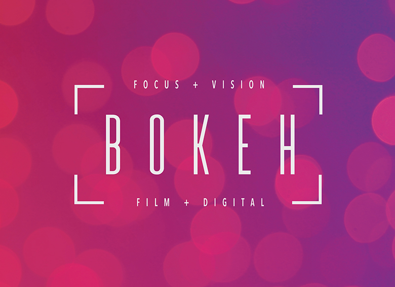
We married the Bokeh word with four others to create the core brand messaging – focus & vision, film & digital. Those four words encapsulate the brand offer and communicate all that needed to be said.
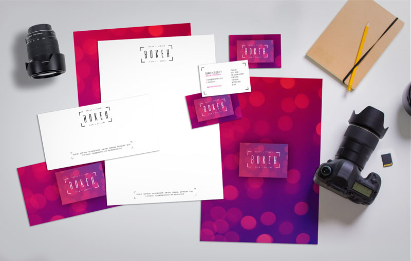
The Bokeh text itself was typeset in an elegant and distinguished modern font within a frame of corners that emulate the focus and composition marks familiar to anyone who has even taken a picture.
The overall look of the logo lock-up is restrained and understated.
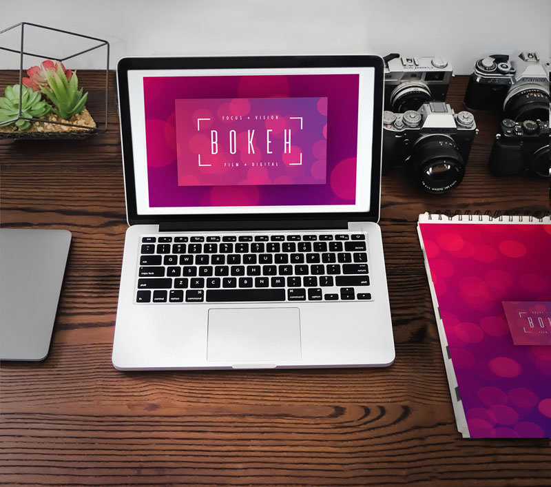
Introducing a background for the primary logo of classic bokeh effect light-balls with a deep rich red and purple base all emphasised the feelings of quality, refinement, modernity and elegance.


 © S2 design & advertising Ltd
 © S2 design & advertising Ltd