CASE STUDY
World Association of Nuclear Operators
The World Association of Nuclear Operators (WANO) is an international non-profit organisation that unites every company and country in the world with a nuclear power plant. WANO exist to achieve the highest possible standards of nuclear safety, helping operators communicate effectively and share information openly. Its mission is to prevent accidents and raise the performance of all operators, globally. WANO operates as a ‘by assent’ safety organisation with seven regional centres.
S2 were asked to develop WANO’s global brand identity. Being an international organisation, WANO’s existing logo, established when the association formed in 1989, had been internationally trademarked and was used extensively in WANO’s seven international centres. Therefore WANO stated that this logo element could not be altered at all – but a reviving and re-establishing of core brand values was required. This was our first challenge.
The second challenge we faced was that, as with most specialised industries, you only understand who and what WANO do if you are already connected to or involved in the nuclear power industry. WANO’s exterior visual presence lacked clarity, recognition and comprehension, which negatively affected their ability to engage with the outside world, particularly policy makers, influencers and government bodies. Being an international voice for nuclear safety when that voice and authority is recognised by very few, if any, outside of the industry was obviously a problem that needed to be addressed.
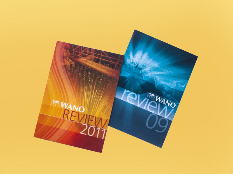
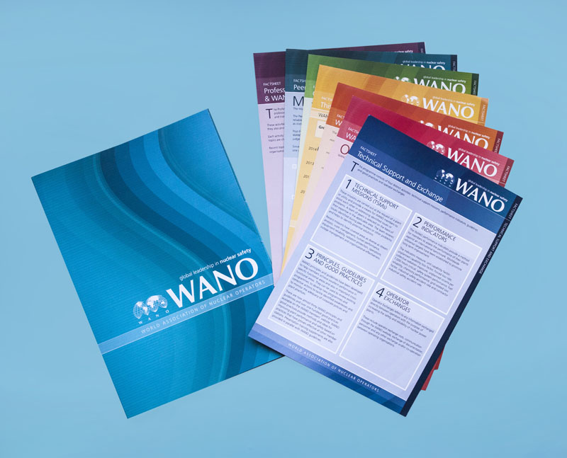
The third and final part of our brief was to revive and update the existing raft of literature and develop new products as necessary to advance WANO’s standing and sway.
KEY OBJECTIVES
- Make the WANO identity visible, without undermining its international trademark
- Explain what WANO does so the general public and authorities can understand
- Update its entire literature and develop a new look and feel.
THE IDENTITY
As the logo could not be changed we decided to work around the problem by creating a ‘holding device’, expanding the entire logo lock-up to contain the full name and a strapline, to give increased impact, gain greater recognition and help comprehension of WANO’s role. By reducing the trademarked logo to an element within a ‘brand block’ which would operate as a whole design element, we applied consistency to all WANO literature.
Working closely with WANO’s team, we analysed and compartmentalised what WANO actually do. Taking this information, we developed multiple straplines, narrowing down to one simple phrase that explained WANO’s role as clearly and concisely as we could – condensing its mission into a few words that any lay person could understand.
The original logo was not only trademarked in appearance and format, but also in colour (Pantone Reflex Blue), which had resulted in a limited primary colour palette. However, working in consultation with WANO’s Communications Director, we were able to develop a softer palette based on tonal variations, and then incorporate a wider range of brighter, more vibrant colours which could be used as the communication requirements dictated.
Once the WANO holding device had been established for a few years, it was necessary to further develop the WANO branding to avoid the risk of it becoming stagnant.
The holding device was therefore further adapted to form a graphical element of a graduation tonal overlay which became known as ‘the swoosh’.
BRAND GUIDELINES AND LITERATURE
With any branding exercise, establishing a consistent application of the brand elements is crucial. With international organisations that cross language and cultural borders, it is even more important to ensure there is consistency. S2 created brand guidelines for WANO covering the usual topics of logo, styling, primary and secondary fonts, colour palettes, stationery, promotional items and some examples and templates for primary communications items.
INSIDE WANO
S2 were also commissioned to design and print the WANO flagship publication, Inside WANO. This was a bi-monthly magazine for WANO members, published in eight languages to serve the global WANO family.
We designed the magazine to reduce costs for our client. As anyone with a desktop printer knows, full-colour printing is known by the anachronism CYMK referring to the four inks needed: cyan, magenta, yellow and black.
By creating a design with the cyan, magenta and yellow elements being consistent across all 8 language variations – with the black plate carrying all language-specific information – we were able to drastically reduce the production cost of the magazine. It made our job as designers much more complicated but delivered a better outcome for our client. Which is always the S2 objective.
Once we had created the revised brand look and magazine WANO worked with us to create all their communications materials; numerous Annual Reports, promotional and information literature, exhibitions, conference staging, award ceremony literature – everything a global organisation needs was overseen by the Communications Director(s) working in partnership with S2 design.
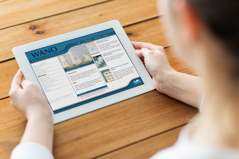
Over the years, much of the industry-specific literature and the regular magazine have been transitioned to become downloadable items housed in a secure area of the website which we also implemented and oversaw for WANO.


 © S2 design & advertising Ltd