CASE STUDY
Graveney Building Contractors
Graveney Building Contractors Ltd approached S2 to revamp its image to help expedite a planned period of growth.
Graveney specialises in high-quality residential projects. The majority of its client base are dual-income professionals investing in redeveloping their property. Predominantly serving a limited geographic area of south London based around Dulwich, Streatham, Balham, and Graveney itself.
The research phase of this project involved a great deal of competitor analysis, as well as customer survey insights. We investigated the company’s perspective and desires, researched the general market perspective for its industry, and surveyed its present customers and wider target audience. This information helped us form its core brand position and messaging.
Graveney was already known for exceptionally high standards
The majority of building firms in direct competition to Graveney appeared to use rooflines or building blocks within their visual identities. Most also used similar colours within their branding.
Particular areas of uniqueness and key differentiators for the Graveney team became evident through our research phase. Graveney was already known for exceptionally high standards – not just in the standard of the finish, but also in their process and delivery. Many previous clients commented on how much the Graveney team’s approach and respect shown towards their property had impressed them.
Building on the strengths identified as important to the target audience, S2 proposed a number of identity options – but our preferred strategy was to create a ‘standout’ impact and differentiation by purposefully bucking all the established industry trends. Iain, Graveney’s Owner/Director, was brave and embraced the ‘distinctly different’ ideas we suggested.
At S2, we are driven by making a real impact for our clients
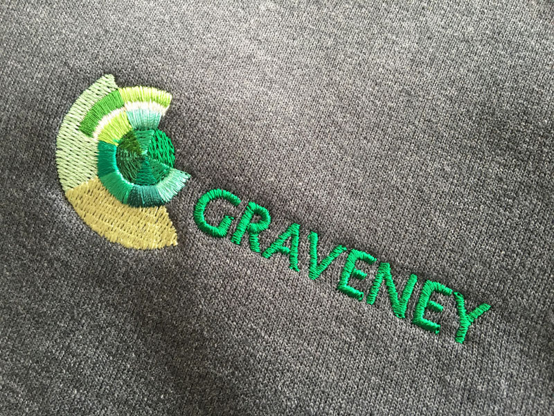
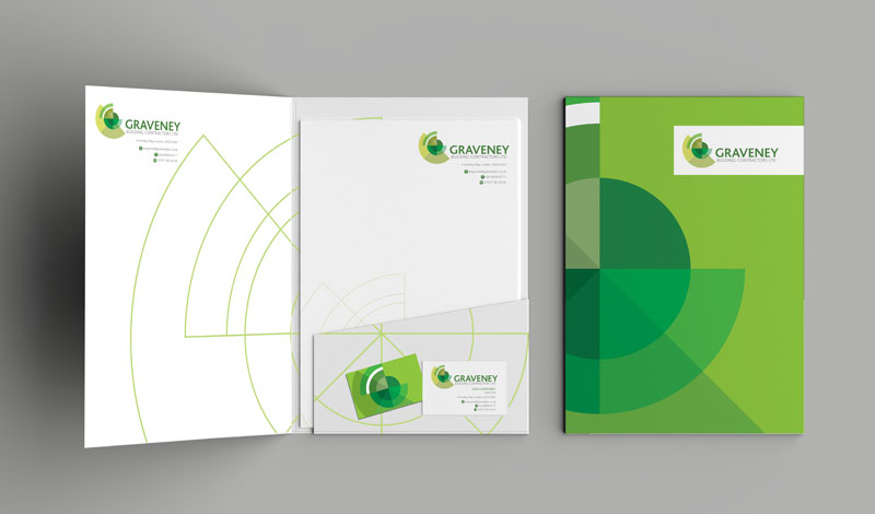
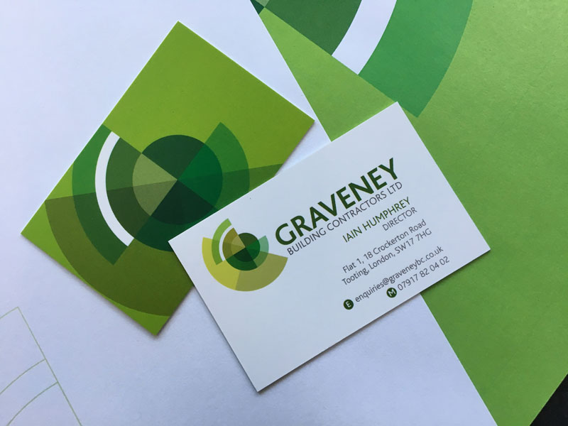
The final identity was devised from ideas drawn from architectural drawing plans and bespoke marquetry. It also contains a stylised G. Green was identified as a colour that wasn’t used by any of the competition – offering brand impact and recognition, as well as relating to the company’s commitment to using more eco-friendly and sustainable building products.
Working with a limited budget, S2 proposed a staged roll-out, with the first phase containing the core brand elements. To date, the brand strategy and identity have been established across stationery (folders, estimates, invoices, letterheads and business cards) and uniforms (including T-shirts, hoodies and polo shirts).
At S2, we are driven by making a real impact for our clients and helping them thrive. Hearing that a client’s turnover has almost tripled since the rebranding is fantastic validation of our work.


 © S2 design & advertising Ltd