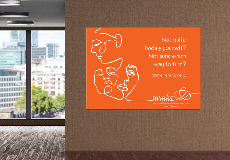
Sutton Wellbeing Mental Health Service
The Sutton Wellbeing Mental Health Service (SWMHS) brand concept was based on the idea that life is never a simple linear A-B process. Especially if we, or a close family member, are dealing with mental health issues. The meandering line then gave rise to the illustration approach of a simple, single line rendering – so reducing any representational complications by avoiding issues of race and age.
Orange was used as it is a positive colour, engaging feelings of vibrancy and exuberance. We wanted to elicit a positive feelings to counter the dark feelings that accompany most people impacted by mental health.
Working within tight budgetary constraints precluded booking any paid advertising so the poster series ‘we’re here to help’ was intended as profile-building items to be placed within appropriate public access spaces: doctors surgeries, libraries, hospitals. Each poster focused on a different programme that the service offered or addressed a different aspect or fact relating to mental health.


 © S2 design & advertising Ltd
 © S2 design & advertising Ltd