

Parallax
If you look at the same object with alternate eyes closed you will notice that the object appears to jump or shift in space. That jump of position is the parallax effect. The optical shift in placement that we perceive. It seemed a good option for a new business consultancy looking to be disruptive within their sphere by the use of technology and a specialised AI system.
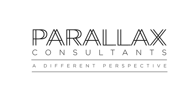
The logotype idea was an extension of that ‘parallax viewpoints’ thinking, with the repeated, double-vision lines creating a minimal, elegant and clever logotype.
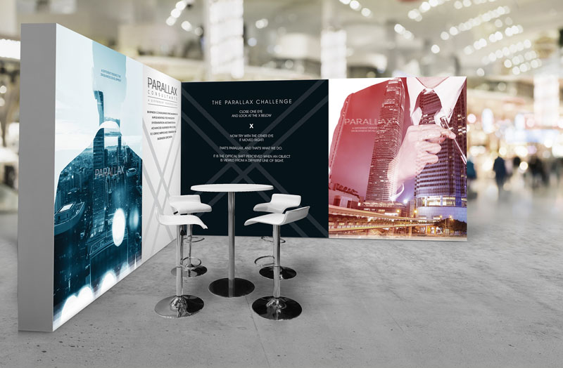
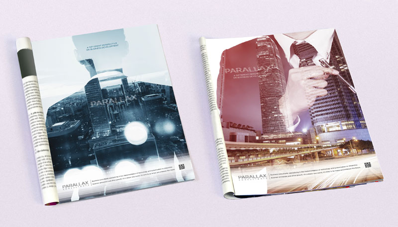
This was further developed in the imagery used – fusing views of affluent city living with business attire as a blended, double exposure image.
Expected to launch at a large business trade show our advertising designs are knowingly information sparse. Trade show brochure adverts are usually quite wordy as the audience are engaged, informed and relatively ‘captive’. We purposefully wanted to create distinction by taking the opposite approach. We didn’t want to explain anything about the firm preferring the theory that creating intrigue could be much more powerful than following the crowd with lengthy explanatory copy.
We created a strong visual link between the adverts used in the brochure and the exhibition stand design, with advert text that simply states: Parallax – a different perspective on business development, with a secondary line that was an invitation to embrace the future and visit the stand to know more. We also included a QR code that would access a brief introductory video.

 © S2 design & advertising Ltd
 © S2 design & advertising Ltd
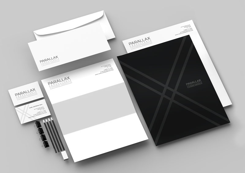