CASE STUDY
Guzzl
Based in Brixton, South London, the gourmet food store Guzzl was launched in 2017. As food critic Jay Rayner said, Guzzl is “full of glorious edible treats” – think farmers’ market – quality produce from independent suppliers. These goodies are also mailed nationwide, with a free local delivery service within 5 miles of the shop.
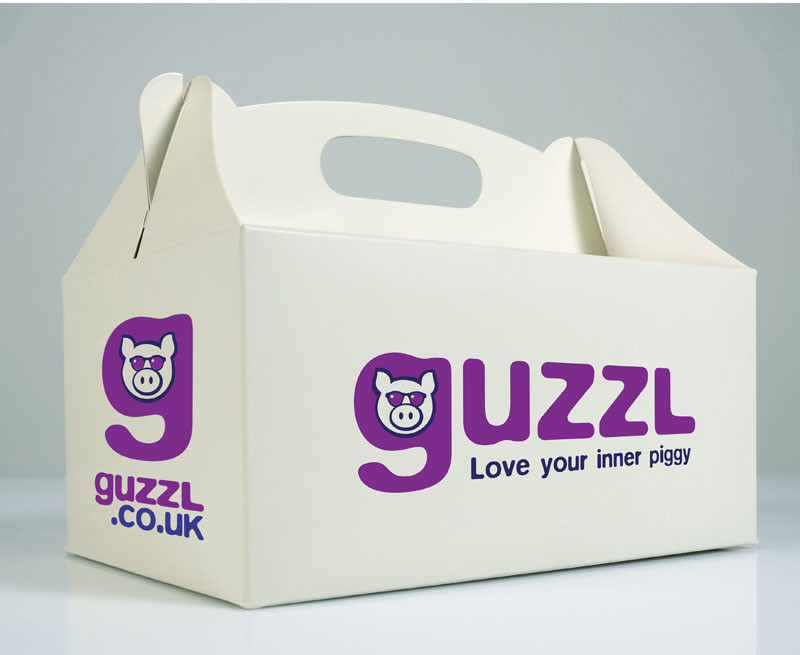
‘Love your inner piggy’ was our starting point
We were given the line ‘Love your inner piggy’ as a starting point for creating an identity for Guzzl, and were asked to develop something that feels friendly, approachable, and appeals to a mass market. The main audience was likely to be time-poor ‘foodies’ with a reasonable disposable income – professionals who enjoy the occasional gourmet treat.
The Guzzl font is an adaptation of an established typeface, thus creating a unique logotype. The softened corners convey a fun, friendly feel, while the cool pig in sunglasses logomark adds to that overall vibe.
The launch of Sozzl
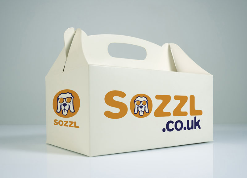
Guzzl’s sister company Sozzl was launched in 2020 and is aimed at the boozehounds – hence our boozy hound icon. Based on the same premise as Guzzl, Sozzl offers a wide range of alcoholic and non-alcoholic beers, spirits and wines from the best local producers, which can be purchased in-store or online.
The logo colour for Sozzl was chosen to reflect the hues of pale ales and cider but had to remain deep enough to be legible against the white background.


 © S2 design & advertising Ltd
 © s2 design & Advertising Ltd