Catford Community Church
Catford Community Church asked us to help them create an identity that could reflect their commitment to serving their local community and would build recognition and trust.
Something that would represent their inclusiveness and that could encompass the various community projects they run as well as representing their church family too – without creating a barrier to the wider community.
We started by doing some work with the church members to understand how they viewed themselves and what the community around them meant to them.
We also did some research and analysis of the demographics of the Catford population.
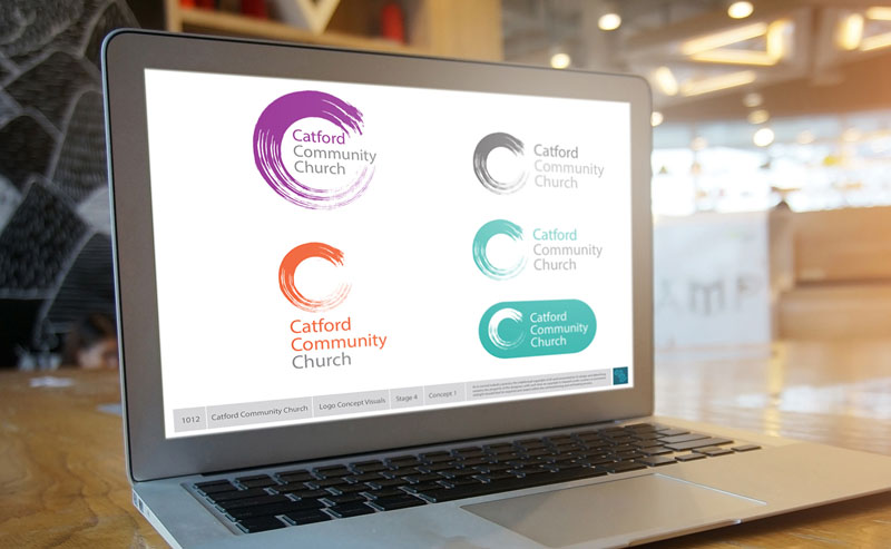
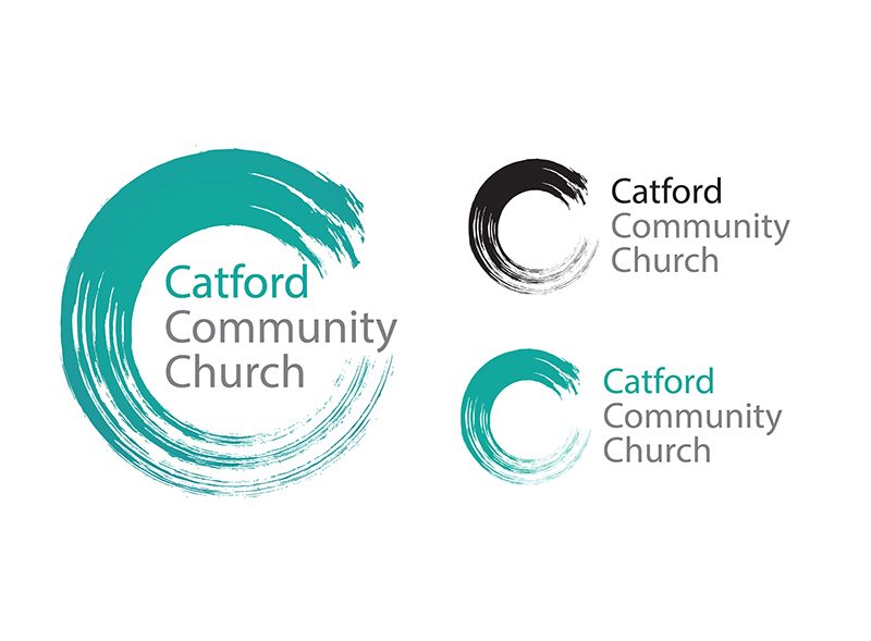
We presented lots of options but the selected design was a simple brush sweep forming a C – that within it had ‘three strands’. So the three C’s of Catford Community Church are contained in the large C of the brush mark (if you care to see them).
The C itself – in the main version of the logo also houses the full church name – embraced within its curve. Like the care for the community within the mission of the church.
We also created other versions of the logo for small usage scenarios where the name housed inside the C would become too small to be legible.
The logo was created to be adaptable in format and colour – even allowing for altering the emphasis of the words if needed by selecting which of the three words would be picked out in colour … Catford, Catford Community, Community, Church.
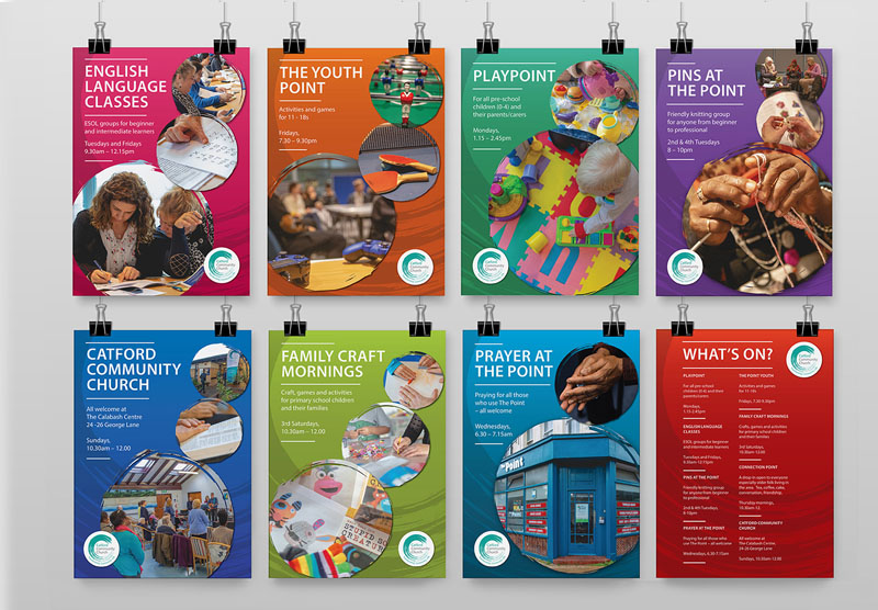
Also shown are a set of poster designs used to promote activities run via the Church run community hub to serve the local people of Catford.





 © S2 design & advertising Ltd
 © S2 design & advertising Ltd