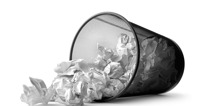
How not to get binned
Every business wants the marketing and communications items they produce to deliver results. But we all know that most of the items we receive may get a few seconds of our attention, at best, before they are cast aside.
Marketers and designers get blamed when returns are not at the expected and projected levels. But I’d suggest it’s a tad more complex a scenario than it first appears.
Generating communication items that create a good ROI is never simple. It’s all about those first seconds – capturing attention, raising interest and instilling a feeling that is strong enough to stop your audience from instantly discarding your email, newsletter, brochure etc. into the trash. Making it past the instant edit of their ‘opening the mail’ routine is key.
Creating items that people keep to hand is a challenge for every marketeer or designer.
Let me share a couple of real life examples.
I had a business contact comment on my business card last week: “It’s always on the top of the pile on my desk… it’s still the best business card I’ve seen in ages.”
This week we met for a 1-2-1 and I asked if I could quote him – just so you could know you can be sure this is genuine and not a fabrication (which I would never do anyway), the above quote comes from Scott Willis of CFO Hub. Thanks for the encouragement and for allowing me to quote you Scott.
Now, I have no illusions about the fact that at least 80% of the communication pieces I create, for myself or for my clients, are destined to end up in the trash pretty swiftly. Either physically thrown into the waste paper/recycling bin or moved into the electronic bin icon on a computer screen.
The big challenge for any business (and particularly the design and marketing teams) is to ensure that the items they send achieve their aims before they hit the trash.
Or, better still, that they are kept around for as long as possible to give a greater chance of the right people seeing, and engaging before they are cast aside.
How can you achieve that elusive ask?
There are 3 recognised ways.
1. Make the item useful
2. Make it aesthetically pleasing
3. Make it relevant to the customers’ needs
… and ideally, it should be all three.
Please note, I didn’t say to make it beautiful. We all know beauty is in the eye of the beholder – but intrigue or unusual design can be more engaging and deliver better results than following the established conventions and traditions that are commonly regarded as ‘beautiful’. Different and interesting will trump beautiful but boring most of the time.
Be different
Scott evidently finds my business card unusual or intriguing enough to keep it around. That’s partly because I designed it specifically to achieve that end. It was purposefully designed to be different – to stand out from the crowd. To grab attention and to be remembered. I’m often told that people remember my card.
For a start it’s square – not the usual oblong business card shape and size. Therefore it doesn’t fit the various filling systems people use to store the cards they collect.
But Scott is only in his early 30s and firmly fits into the digital native generation. Like most of us he probably just adds his connections directly into a CRM system or connects with them directly via LinkedIn. (I have another electronic card that makes that process super streamlined but I won’t get into that here).
But I’d like to think there is more to Scott keeping my card than it simply not fitting his chosen storage system. That there is ‘that indefinable something’ that means he hasn’t simply cast my card into the bin. Maybe, it is because he wanted to book that 1-2-1 meeting and the card acted and he kept it to hand as a visual reminder? The actual reason it is still on top of the pile of cards on his desk is not as important as the fact that it is still there!
Whatever the reason (for him) the intent behind the design worked. Maybe it was the design itself – or maybe it was the spot varnish on the face of the card highlighting the stylised S2 text that forms our logo. Maybe he just liked the colour.
The fact is that the totality of the card design meant he kept it to hand. When sat at his desk he has a constant reminder of S2 design and of me personally. So the desired action was achieved.
Good brand design is all about getting noticed. Being recognised, respected and remembered.
I tried to embody that thinking within the approach and design of my cards. Modelling tangibly the strategies I promote to my clients. Strategy and an understanding of human psychology are two of the most vastly underrated aspects of any good branding exercise.
Unfortunately, lots of companies concentrate their efforts on the aesthetics of their marketing output and not its actual impact. Useful and relevant are arguably more important to your target audience than how good it looks.
Now that might seem a strange thing to say as a designer, but it’s true.
It’s not an excuse not to make things look good and user-friendly – but I’m sure we all have things in our houses and in our offices that we keep around simply because they are useful. They serve a purpose and that purpose is more valuable to use than how they look.
After all, my office filing cabinet is not particularly good looking – but it’s useful and the service it offers me is relevant to my daily needs. The same goes for my stapler or the case for my glasses.
However, design can be a huge aspect of why transient items of communications and marketing do make it beyond our initial ‘edit’.
So, what other items can I tell you about that I know have held some ‘keepsake’ appeal?
When I was looking for my first full-time job after completing my degree, I created a CV that I know won me more than one interview opportunity simply because of its design and construction.
I graduated in the early 90s when we still trawled our large portfolios around to physically visit the creative directors of agencies in their offices. We also still used the Royal Mail to send out the letters and CVs that we used to secure those interview opportunities.
My CV wascreated to be get itself noticed from the piles of other CVs arriving at those agencies – and was specifically designed to immediately capture attention as soon as the envelope was opened.
When removed from its envelope my CV would quite violently ‘pop-up’ into a self-constructing pyramid. The mechanism was triggered by an internal rubber band which was held in its ‘primed’ state by the tension of the envelope. The envelope itself was an unusual corrugated card design, which suggested psychologically that what was inside was unusual, that it was valued and that I had invested in this opportunity to present the contents to the agency.
Once ‘popped’ the resulting pyramid was about 17cm tall, and the different faces of the pyramid held the usual details found on any CV.
I know that some recipients kept it simply because of its novelty factor. Some kept it, they later told me, to figure out how I’d made it.
One recipient specifically called me to tell me it ‘nearly took his eye-out’ – bouncing off his glasses. But he called to talk to me even though he was not hiring at the time.
I also know that CV lived on the desk of my boss (at the first job that I did land) for a few months. I also know it was retrieved from his bin on at least one occasion because he couldn’t figure out how to collapse it and ‘it took up too much room in the bin’! Not the reason I expected it to be retained but I wonder if the same thing happened at other places I’d sent it? I do know that I got call-backs well after I’d secured that first job and well beyond the period you’d expect a normal CV to generate calls.
A few years, and two jobs later, I was working at a small agency in West London.
I was commissioned to create a ‘coffee table item’ to promote all the arts and cultural events throughout the coming year scheduled to take place in the borough of Kensington & Chelsea. From the Royal Opera to Notting Hill Carnival and a myriad of about 60 other events from poetry readings to ballet.
The final items created were an A4 booklet accompanied by a website and an online calendar of events. The graphic styling was very adventurous for a local council and the paper stock used was unusual, the layout was both modern and bold – but also allowed for the individual events to retain a sense of individualism. Our client loved it and it still remains one of my own personal favourite pieces of work.
But more than that, it did what it needed to do. It was useful to the intended audience and it was striking enough to hold its place on the coffee tables of the Kensington and Chelsea residents throughout the year of events it covered. And beyond!
I know this for a fact because I happened to show it as a sample to a potential client of a few years later and they instantly responded with “Wow, you did that. We had that in our house for ages. Always wondered you’d designed it. I think we only threw it out recently when our toddler spilt his juice on it and ruined it.” (I’m paraphrasing as I don’t recall their exact words)
I’m not telling you these stories simply to take a walk down memory lane – nor to brag. One example pulled from every decade I’ve been working is hardly an extensive or impressive list.
But with these stories, I do want to challenge everyone involved in devising communications, be it marketing or purely an information piece, to think a lot more about what they are doing – and to consider how they present their items a little more strategically.
How will that next piece of communication get noticed? How will it stand out from the plethora of items we each get bombarded with daily? Apparently, the average person in the Western world sees between 4,000 and 10,000 advertising messages every day! Getting noticed, commanding your audience’s attention, capturing their interest beyond the instant toss into the trash and earning the right to engage them a little further… this is precisely what all our communications efforts are aiming for.
After all, if you don’t have their attention, you won’t have their business.
Good communications items, and good marketing, are created through a union of great copywriting married to great design – these are the foundation stones needed to get yourself noticed.
Once noticed you have a chance to communicate a little more. If the design and copywriting do their job you start to engage your audience enough to grant you a few seconds of their time – and in that time and ‘attention transaction’, you get an opportunity to plant your flag in the mind of your audience.
If you can claim that ‘mental real-estate’ in their minds as the go-to company for your service then you have achieved what 95% of businesses fail to do. And once you have claimed that mental real estate it’s far easier to defend it than it was to claim in the first place.
Getting noticed in our busy world is arguably getting harder. I’ve not even talked about the specifics of social media in this post – but the core principles are the same.
Make an impact – get noticed, be seen. No one wants to be invisible.


Leave a Reply
Want to join the discussion?Feel free to contribute!