CASE STUDY
Christian Medical Fellowship
S2 have worked with CMF (Christian Medical Fellowship) for over 25 years. That’s before S2 even existed in its own right, when our Creative Directors, Darren and Andy, were the creative leads at a London agency that held the CMF account.
S2 have a proud history of working in the NFP, NGO and third-sector arena, particularly with Christian charity organisations.
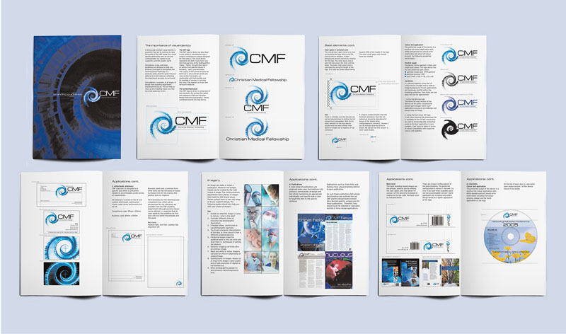
In our time partnering with CMF, we have overseen a full rebrand and defined the look of all of its key publications and communications materials. We are proud that our working relationship has been maintained and remained strong, despite changes in key personnel at CMF in both the most senior management and communications manager roles.
S2 was commissioned to revamp CMF’s brand image and key publications
Founded in 1949, CMF is a national charity that provides support and information for medical professionals. It is also heavily involved in debates on medical ethics and legislation. In 2005, S2 was commissioned to revamp its brand image and key publications. As always for S2, this process started with research and in-depth discussions with the CMF team.
The previous logo had been in use for many years and reflected a time when the organisation had links with many other professional bodies. A new look was needed as CMF broadened its horizons – but we were also mindful of its strong history and legacy, which the organisation could capitalise on.
The previous logo was based on a flat representation of the helix structure of DNA, and the organisation’s key publication was called Triple Helix. These two factors became the jumping-off points for our new identity, and we worked with the senior staff at CMF to explore various concepts.
S2 have been working with CMF, its student body and two affiliated organisations
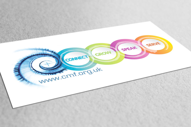
The final logo choice pays homage to the original – we retained the core element of a DNA helix but turned the viewpoint to look down the spiralling DNA structure. We added a cross in the middle to reflect the core Christian motivation of CMF’s vision – which is firmly (and now visually) at the centre of its DNA. It also has a double meaning – the recognised symbol of the Christian faith, but also the visual shorthand used to identify hospitals, pharmacies and other health centres – the cross is recognised across the globe as a shorthand symbol signifying medical care.
CMF has two flagship publications – Triple Helix (for doctors) and Nucleus (for students) – and publishes other support literature and books. CMF also organises conferences on a local and national basis and helps to promote and support medical mission at home and abroad.
S2 have been the primary design supplier for CMF, working with its student body, as well as two affiliated organisations – Nurses Christian Fellowship (NFC) and Care Not Killing (CNK), a political lobby group that works to protect the rights of those who need palliative care. Examples of our work for these organisations can also be found in our portfolio section.


 © S2 design & advertising Ltd
 © S2 design & advertising Ltd